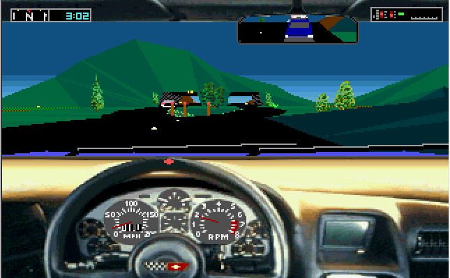
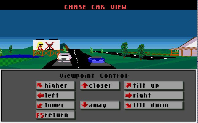
Here's a batch of screenshots to try out. In the middle I start from another direction, but they end up to where the first ones connect:
download shotsA few notes:
-Doors, characters, and monsters are all in 3D and tend to "float" a bit when the camera is moving. Don't use them to line up your shots, the background is better and is totally static
-While I'm sure it won't be possible with these shots, try to blot out the player character and monsters if the shots allow the overlap. If you can't overlap them, don't worry about it for now.
-Don't try to connect this to the main map I've started, it's already been change. I'll work on different areas and just use your file to add to it once you're done.
-You may already know this, but I recommend working with the layers in partial transparency when lining them up as it makes it MUCH easier to see whether they line up exactly or not. Afterwards you can change the opacity back.
Thanks for the help! The map should look pretty neat once it's done.


